Green House Mobile Ordering App Project
This solo project involved the end-to-end process, from research to design, for a mobile food ordering app tailored to Green House, a Korean restaurant in Argentina exclusively operating as a pick-up service without dine-in space. The restaurant offers a variety of dishes, including Korean fried chicken and spicy rice cakes. They currently lack an online menu or ordering system, so customers must call the restaurant to inquire about dishes, prices, and place their orders. They are also faced with a language barrier, as the staff primarily speaks Korean, which poses a challenge for non-Korean speakers in navigating the ordering process. The proposed mobile ordering app aims to provide users with easy menu access and a convenient way to place individual or group orders without the need for phone calls and inquiries. Throughout the project, I conducted interviews, research audits, and usability studies, creating personas, user journey maps, wireframes, prototypes, and mockups.
For this project, I employed sample user bios for the interview process and developed empathy maps to gain a deeper understanding of users' wants and needs. Through these processes, one key finding emerged: the primary users represented a diverse age range, typically ranging from their 20s to 50s, who either did not have the time or the ability to cook due to their busy schedules.
Further research uncovered that some users often placed large group orders, involving family, friends, or even co-workers. This tendency to make substantial group orders typically extended the ordering process, making it longer and more complex.
Based on the research some of the pain points that I found were that:

Using the identified user pain points, I crafted a persona and problem statement to guide my design.
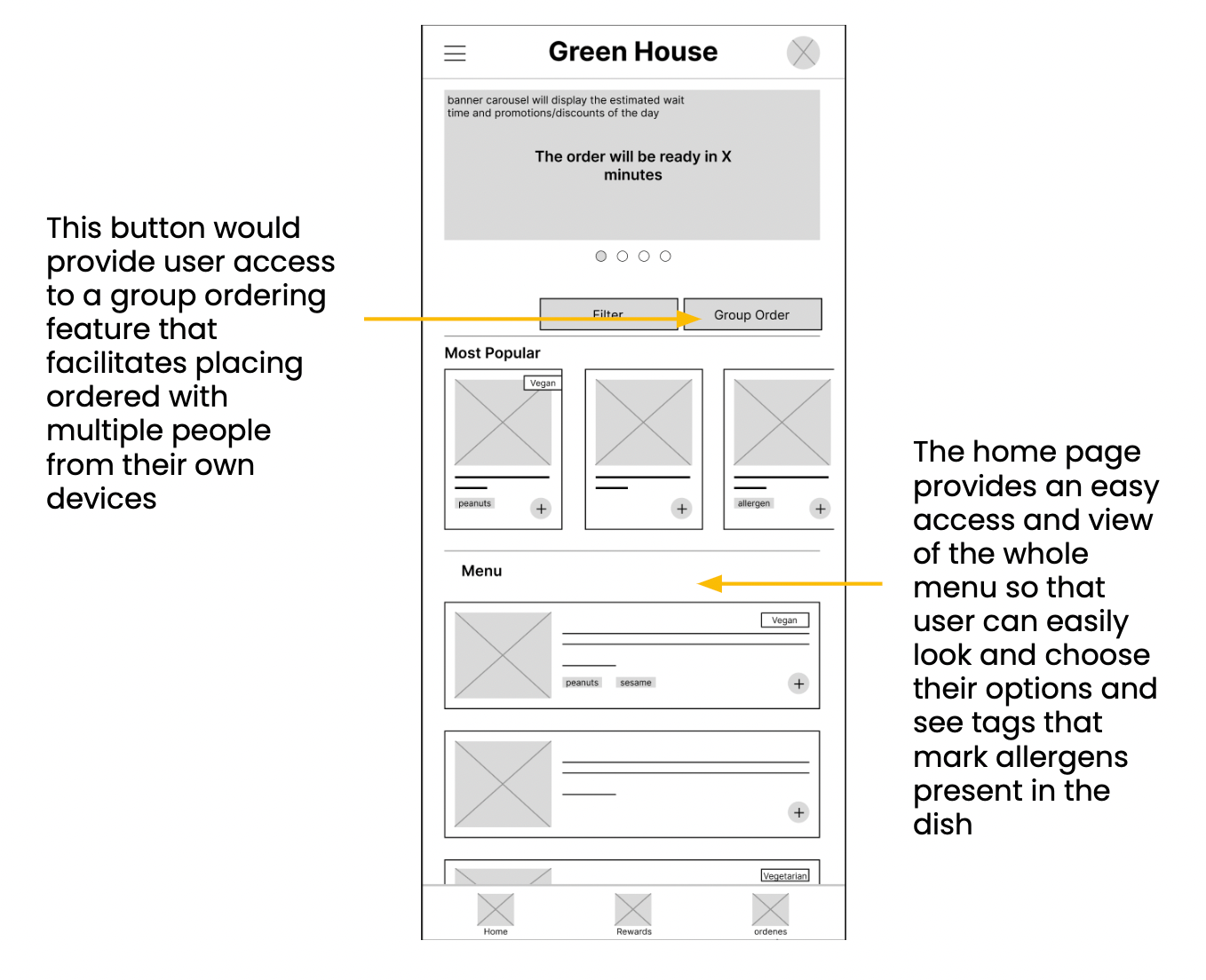
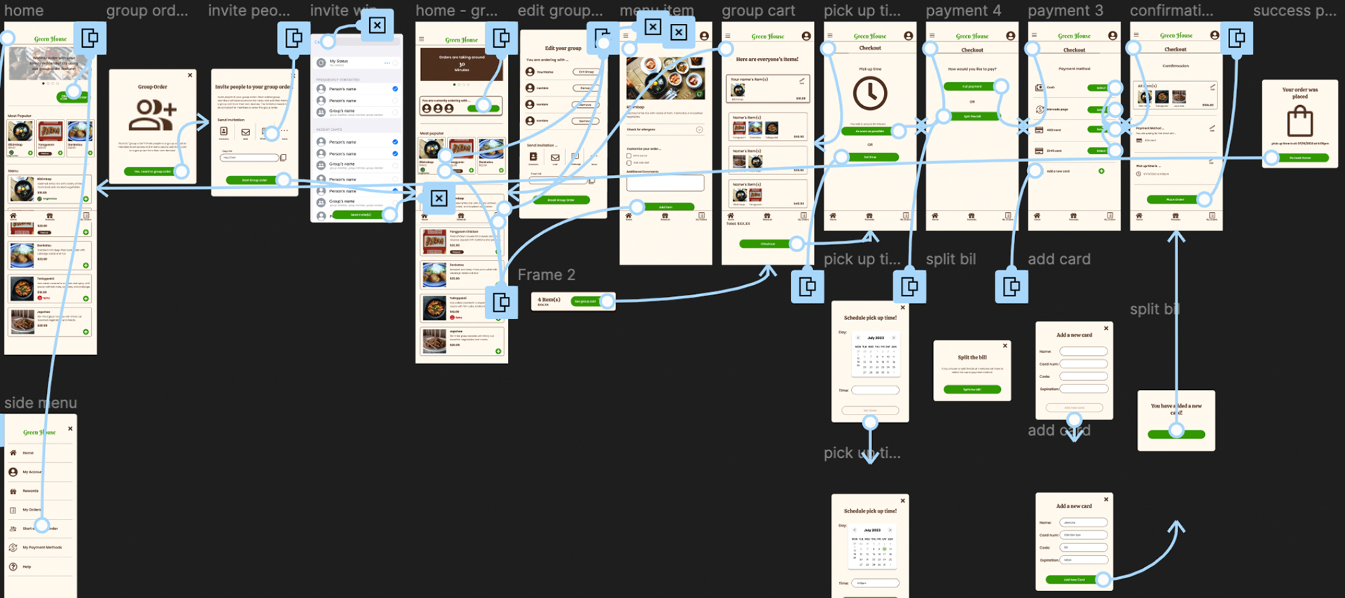
Based on the user's needs, I drafted multiple paper wireframe versions of the home page layout with their pain points in mind. Prioritizing the menu display and streamlining the ordering process for potential group orders were the focal points for the home page.

I designed the digital wireframe and low-fidelity prototype based on user research and feedback as well as the findings of the research audit on the competitors that I had conducted previously.
With the low-fidelity prototypes, I conducted my first round of usability testing, where I found that:
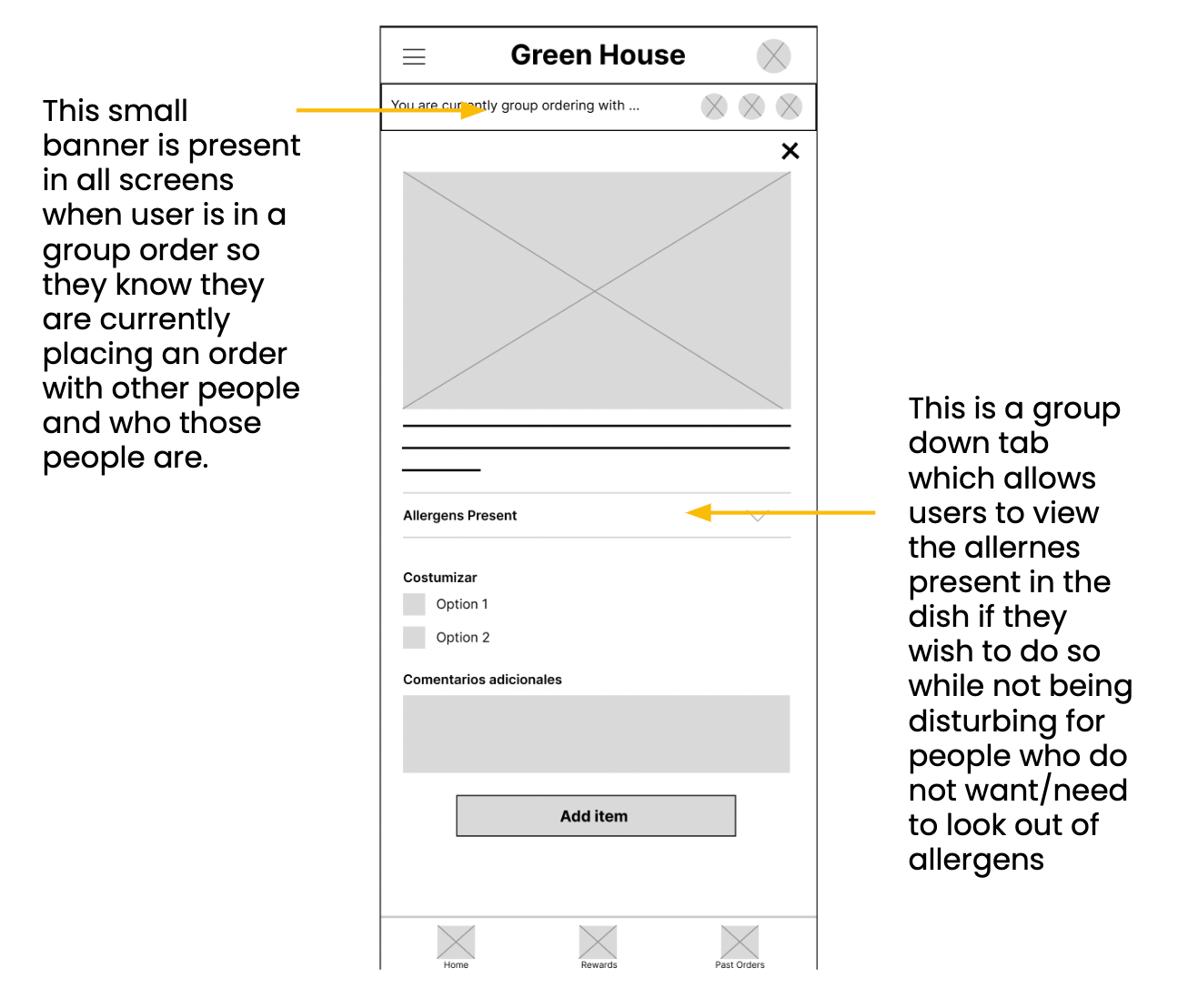
1. Users were confused by the group ordering feature and needed more explanation on how using the function would benefit them.
2. Users required a clearer method to add members to the group.
3. Users sought more easily identifiable markers for meals that followed dietary restrictions.
4. Users desired the option to either pay in full or split the bill among group members.
After receiving feedback and considering the new data, I created more refined mock-ups and a high-fidelity prototype.
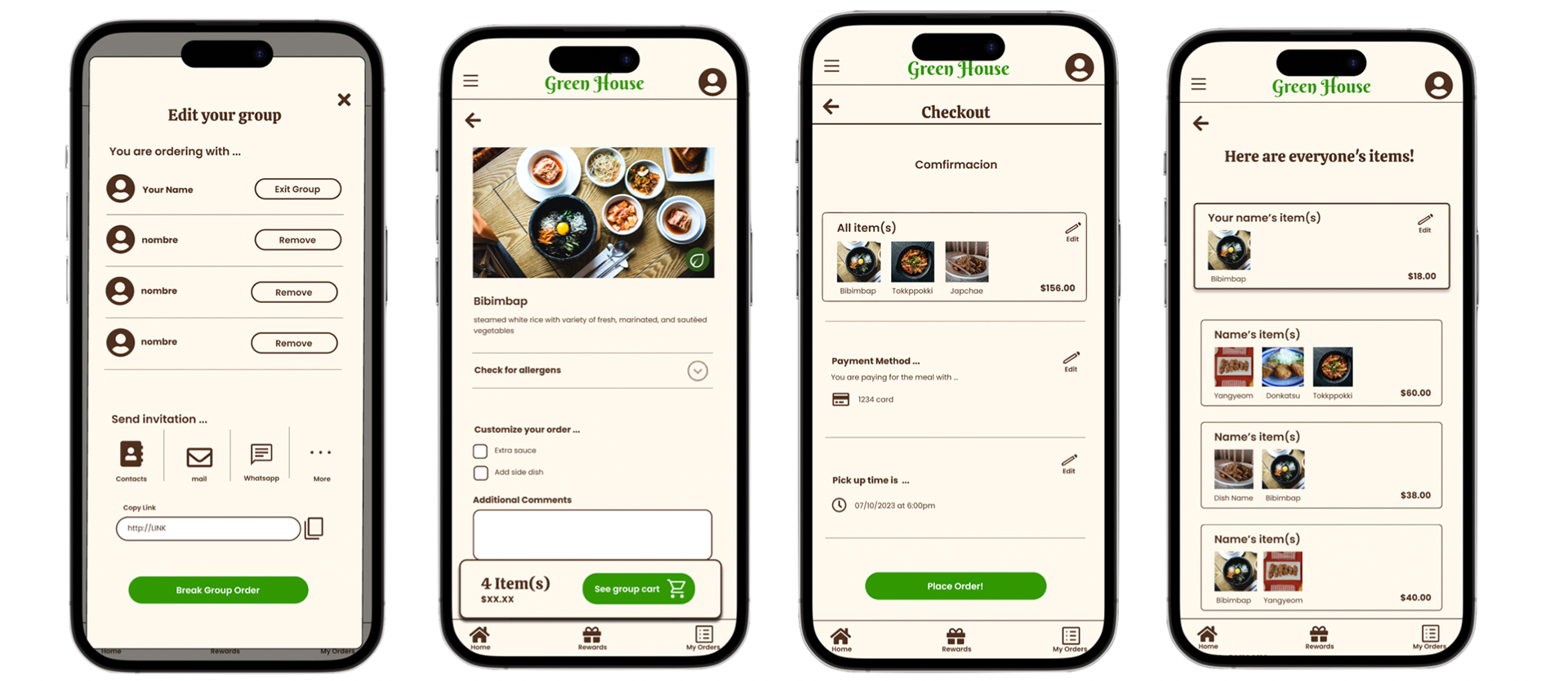
"With the high-fidelity prototypes, I conducted a second round of user testing, identifying the following points:
1. Some steps in the wireframe were left to the users' imagination and need to be added for a clear process.
2. The 'edit group' screen requires improvements to help users understand how to remove members, exit the group, or dissolve the ordering group.
3. All users expressed a preference for paying by cash, so this should be included as a payment option."
Afterwards, I created a finalized version of the high-fidelity prototype, implementing changes based on the feedback received!
Throughout this project, I have once again learned more about the significance of user testing and implementing their feedback. There were times in the design process where I anticipated users taking a certain course of action, but their behavior proved otherwise, prompting me to rethink and redesign my ideas.