NASA Soundscapes Apprentice Page Re-Design Project
This was a team project that we worked on with the Soundscapes team under the NASA who's goal is to educate people of all ages about solar eclipses and aims to make the experience of an eclipse be more accessible for people with lower vision and visual impairments.
The goal of my team was to make redesign their websites "Apprentice Training" page for people around the range of 13-30 years old. We also had to be conscious that Wordpress was being used for the creation of this website and our changes had to be within the range of what was possible in this software.
The "Apprentice Training" page consisted on a long scroll that had multiple educational lessons and activities focused on the theme of solar eclipses. Our initial thought on the page were that they scroll was too long and that the amount of information in a single page consul be overwhelming to users. We additionally noticed that the the spacing between activities a videos was inconsistent and that there seem to be no clear visual hierarchy to indicate the distention between lessons and activities.
To have a better understanding of what the actual issues on the page were and what changes could be made we interview 6 people within the age ranges of 13-30. The general consensus that we go from observing the 6 users use the page and from their answers was that they did not enjoy the long scroll and would rather enjoy the use of multiple hyperlinks and buttons that led to other pages. They said that it would make the information less overwhelming and also more engaging. They also mention that when using an educational page the first thing they look for is the organizers such as nav bard and tables of content.
After the interviews we took in into consideration our clients requests and needs as well as the users responses and experiences with the page into account to create an information architecture 2x2 matrix to have a better understanding and visualization of what we wanted to focus on during this project.
What we found was that we needed to focus on creating and learning environment tat would interest and engage younger audiences in the topic off solar eclipses. We needed to make the content feel less overwhelming, most likely with the multiple tabs methods., most likely with the multiple tabs methods.

We also did a comparative analysis were me took a closer look and the strategize used in other educational platforms such as the NASA, National Geographic, and Brigthspace. After investigating them we were able to see what methods they utilized and which of them were successful and which were unsuccessful.
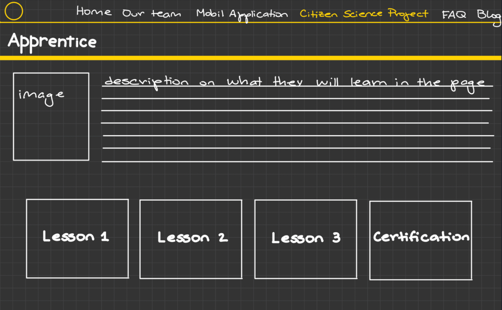
From all the information that we gathered from the interviews, observations, the information architecture, and the comparative analysis we created the first wireframe of the redesign.
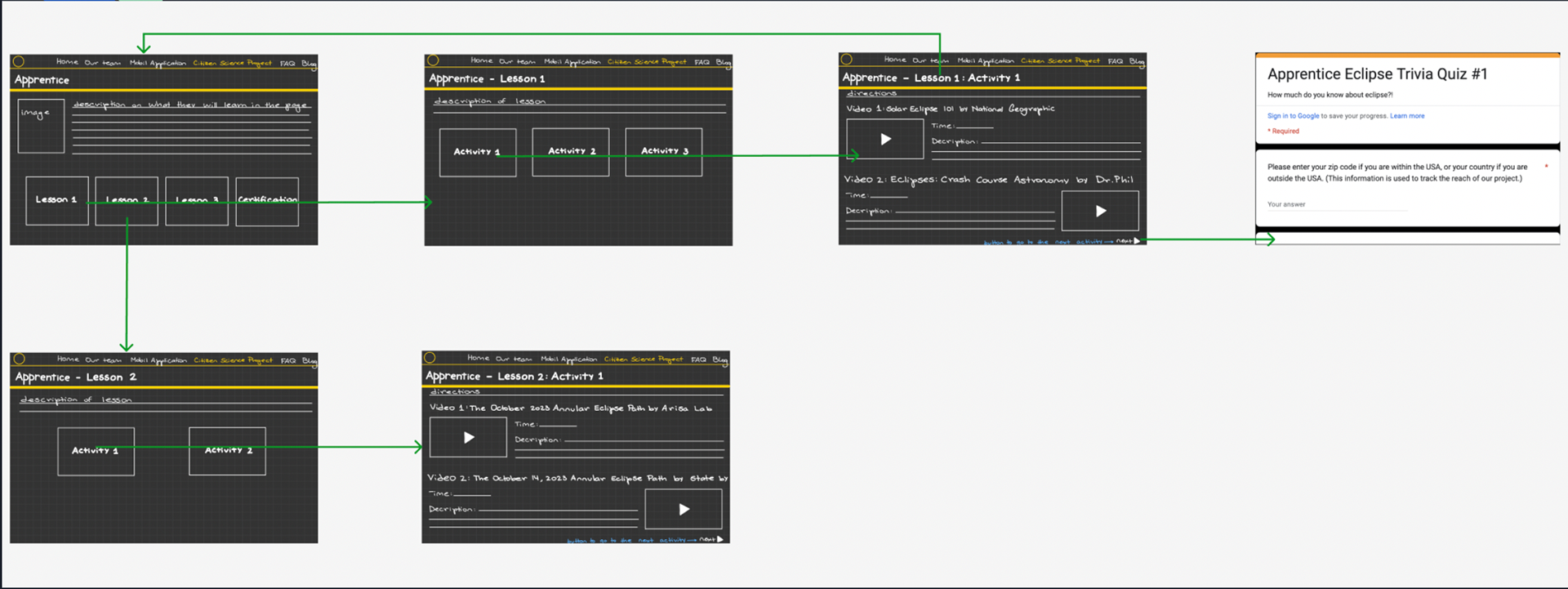
In this wireframe we focused on creating a multiple table methods which would provide the user with a less overwhelming and engaging experience since they would now be welcomed with less amount of information and little by little get thought it and be able to have a clear idea when a lesson or activity ended. My teammates and I also edited the layout of the text and videos so it was easier to read and was less visually clustered.


For the next steps of this project we would like to do user testing and create a prototype and later a more advanced prototype and user test it once again. We would also like to assure that the page was following the accessibility guidelines and add a "dark mode" feature.