TikTok Ad and Sponsorship Disclosure Project:
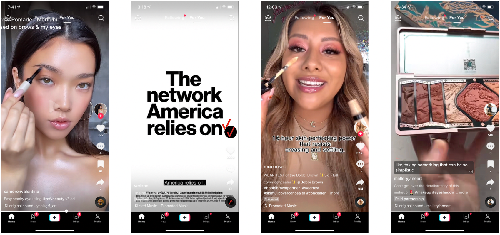
This project focuses on making the disclosure of ads and sponsored content more transparent for TikTok users. The current methods employed by the social media platform can be deceiving and hard to spot, especially for the platform's younger audience and people with low vision. The current system consists of a low-contrast tag that is also placed in a low-priority section of the visual hierarchy. Additionally, there are multiple instances where content creators do not add the tag and just include the "#ad" caption and act as if the services or products are their favorite without disclosing that the said video is a paid sponsorship or partnership.
This is what the current ad and sponsorship disclosure system looks like:
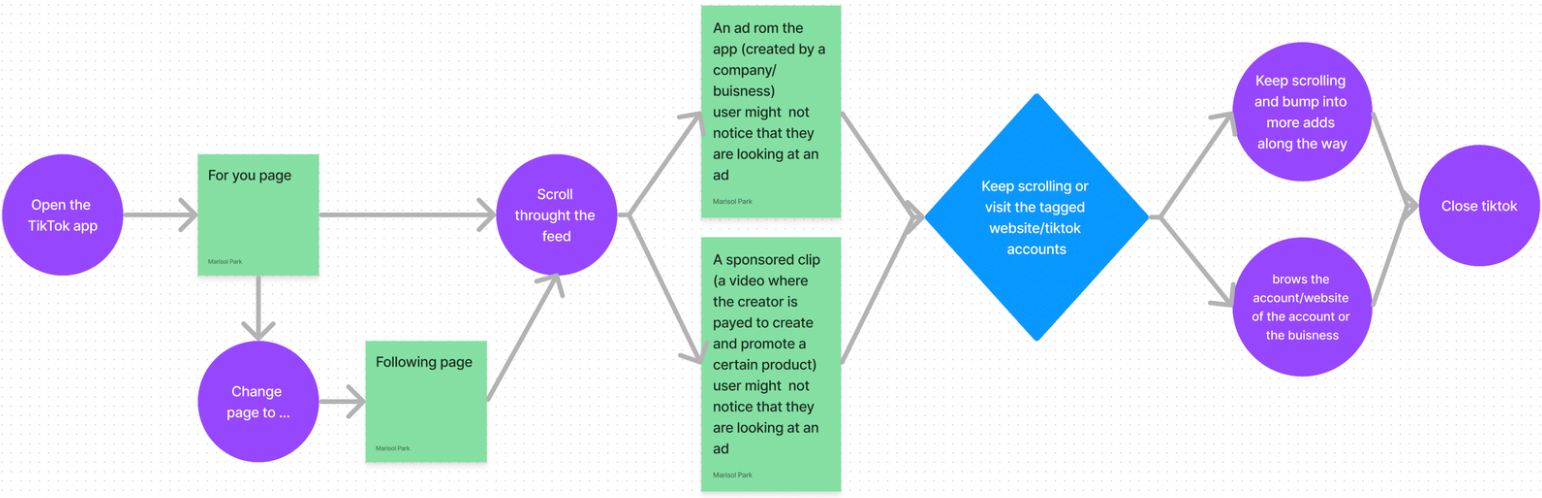
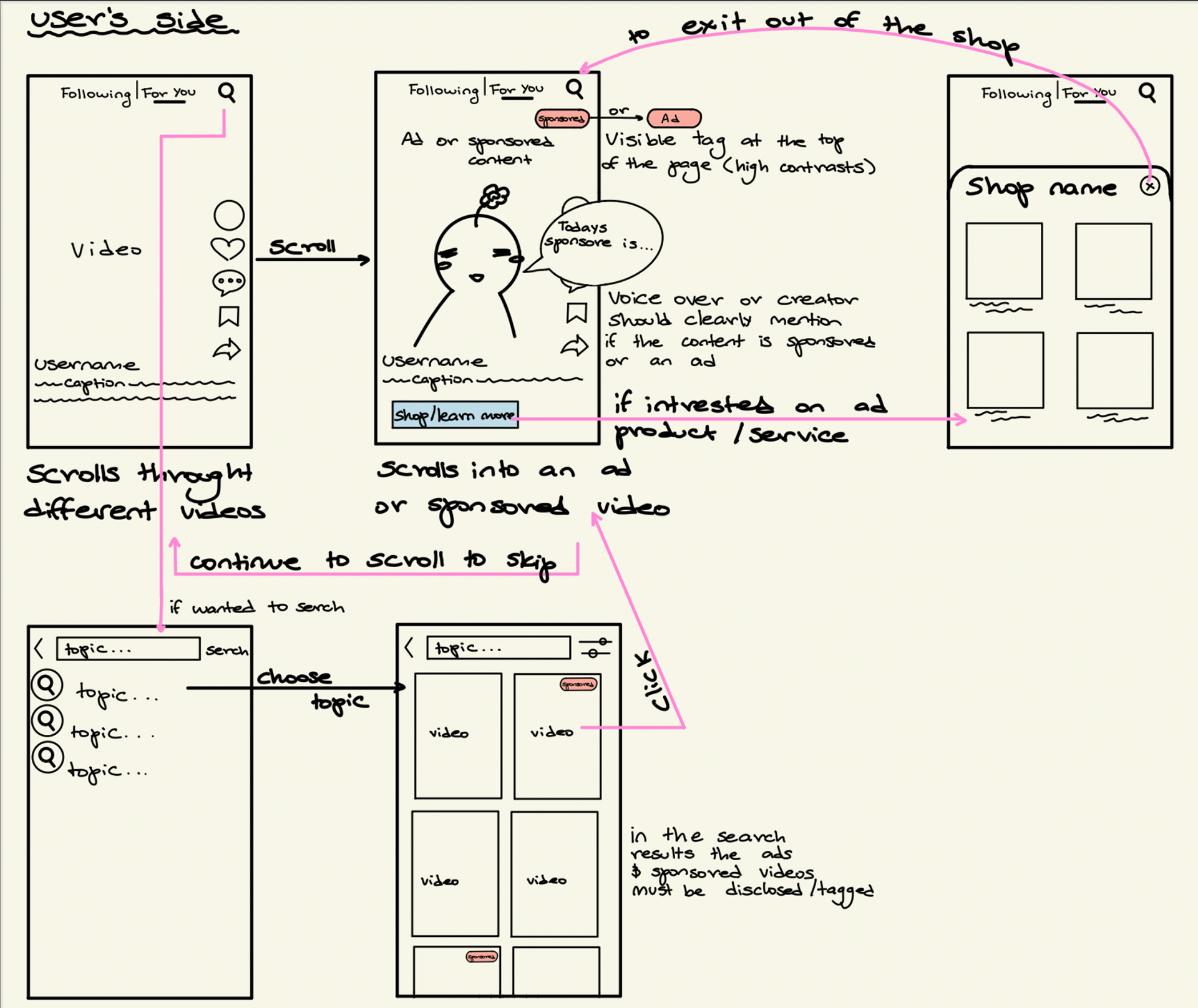
The current user flow of the TikTok audience consists can be seen in the diagram below.
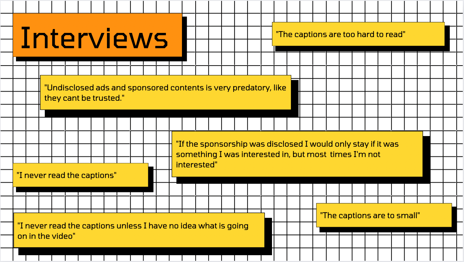
To learn more about the issue at hand and gain a better understanding of the user's pain points while navigating through TikTok, I observed and interviewed six different people about their experiences with TikTok, ads, and sponsored content.
The general responses that I got from the interviews were...
Some of the observations I made were:
1. Sometimes people recognized ads and sponsored content right away.
2. There were still multiple times when they were not able to spot ads and sponsorships.
3. A lot of the users scrolled at a relatively fast pace.
4. Most users were annoyed after bumping into so many undisclosed ads.
5. Most users had ads and sponsored content on their "For You" page, which I thought was the norm. However, one of the users did not get a single ad the whole time they were scrolling.
From these observations, I created multiple user journeys reflecting the paths. One of them was from Aisha as seen below.

I conducted a comparative analysis of YouTube, Instagram, and Snapchat to see how other social media platforms were handling the disclosure of ads and sponsored content. Through this analysis, I concluded that YouTube was the platform that did the best job of clearly indicating when content had ads or sponsorships while maintaining profitability. I took their practices into account while also considering the differences in content format between YouTube and TikTok.
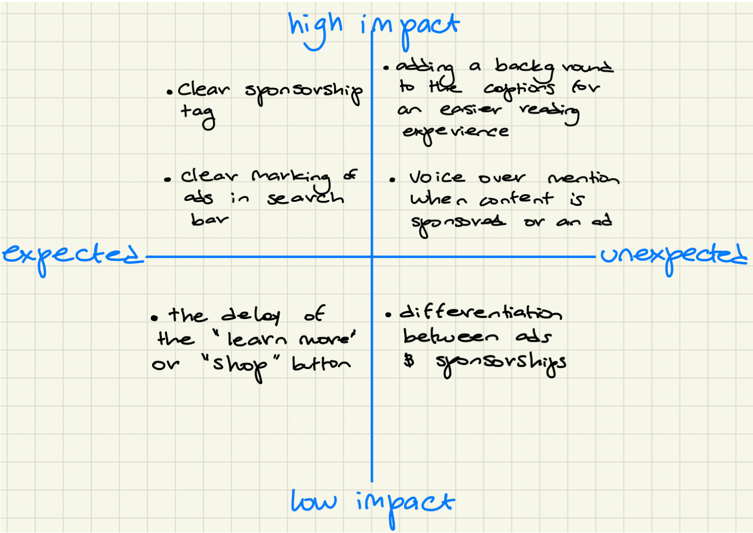
I also utilized the 2x2 matrix method to have a better understanding of what features needed to take priority during the design process. Ultimately, what ended up being most important was creating a clear way of marking and disclosing ads and sponsorships in the videos.
After gathering and analyzing all the information from the interviews, observations, comparative analysis, and information architecture, I created the first wireframe for the new TikTok feature. This iteration focused on adding a tag as a clear way of marking and disclosing ads/sponsorships in the videos as well as in the search results. I conducted user testing with this wireframe, and some of the feedback I received indicated that overall, the placement of the tag was good. However, the red color gave them a sense of danger or warning, and there was a suggestion that the 'Learn more' button should be the same color as the tag since they are related to each other.
Integrating the feedback that I received from user testing, I created a prototype using Figma. For this prototype, I experimented with different colors and shapes for the sponsored tag and the 'Shop' or 'Learn More' button. I also increased the size of the captions and added a black box in the background for an easier reading experience.
After another round of user testing, I once again received more feedback from my users. The general consensus was that the bigger text and the addition of the black box around the captions made the captions much easier to read, and the color of the sponsorship tag had good contrast against the clips playing behind. However, even though the tag was easy to spot, the text inside the tag was a bit hard to read. Additionally, some users mentioned that the 'Shop' button was too distracting and taking the viewer's attention away from the content.
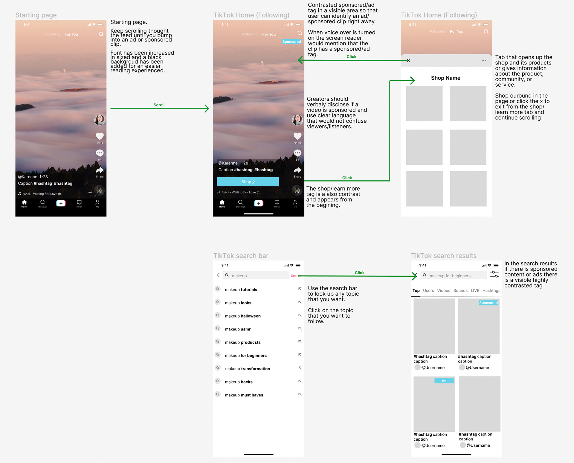
After incorporating the feedback, I created my final prototype using Figma. For this final version, I slightly changed the color of the tag and the button to be a bit darker and more contrasted against the white text. I also made the 'Shop' button smaller to make it less distracting from the video.